Cashmere Collection
A soft, textural palette featuring subtle green, quality timber and rubbed brass accents. The colour scheme is a nod to a dusty Australian landscape, inspired by the locally manufactured cashmere. Joinery displays are refined with simple detailing, creating a play of light and shade. The store has a gentle 'push and pull' between hard and soft design elements.
Scope of Work
Concept Design, Spatial Planning, Custom Joinery Design, FF&E Selection, DA & Heritage Approval, Construction Documentation, Construction Phase Management
Photography
Michael Wee
Awards
2019 IDEA Awards - Retail Category - Shortlisted


Decorative ceramic pendants hang above the sales counter and shine light onto the display below. The two-tone wall units are simple showcase the folded cashmere sweaters. We re-use the existing timber floor and stain to a new colour that is more complimentary to the dusty palette and earthy undertones.

Rubbed brass panels clad the front of the sales counter and introduces a rich, burnished colour. The shadowline detail accentuates each panel for a subtle effect. The countertop is a softly textured yet durable render. Each finish is tactile and refined, much like the cashmere sweaters on offer.


The monochrome wallpaper in the change room is a luxe, surprise element and peeks behind a green velvet curtain. It is feminine and welcoming. We soften the space by introducing flattering back lighting and sweeping curves on the oversize mirrors.


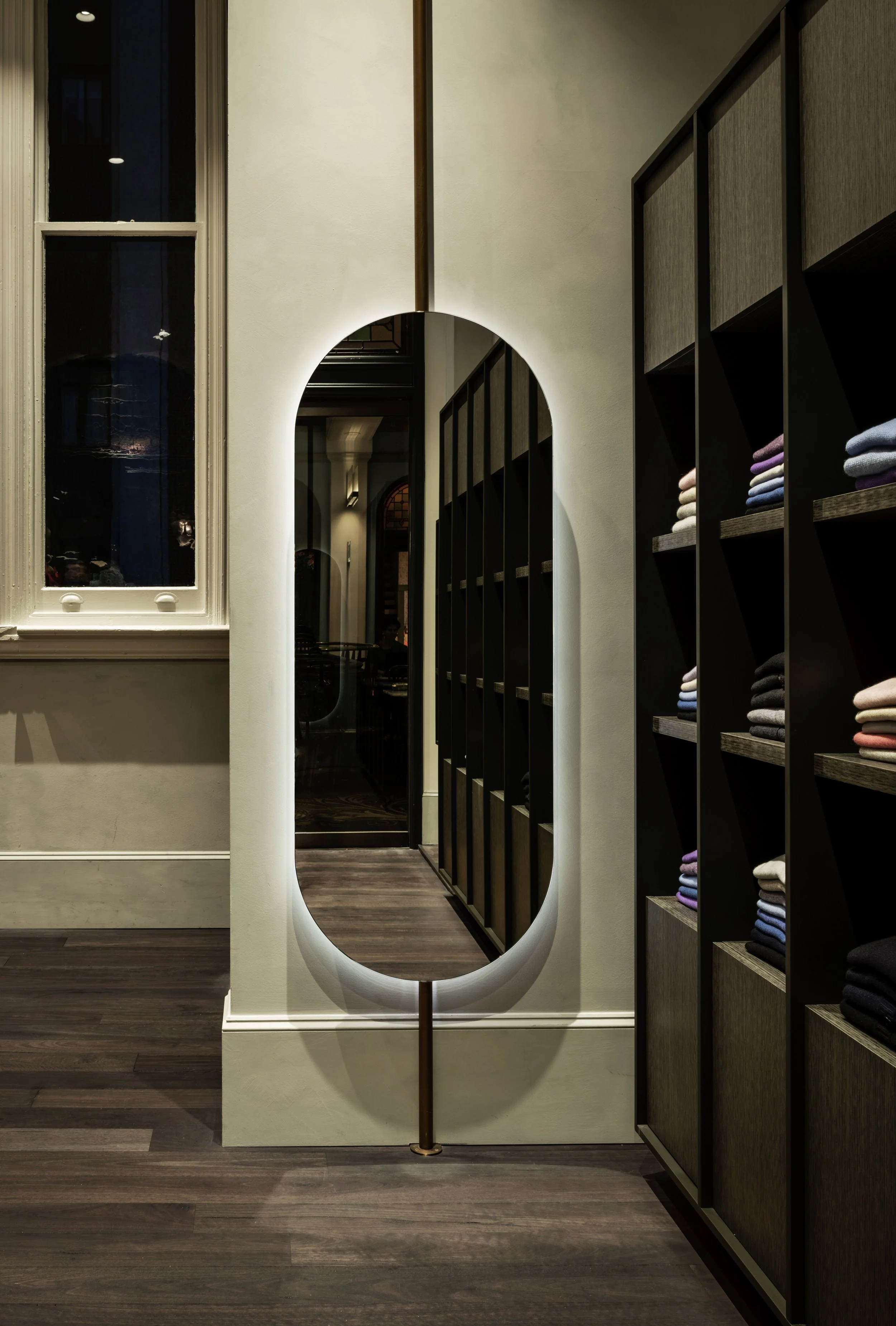
A central island unit offers another area for display but also additional stock with ample cupboard space. The bold, rounded mirror contrasts the large, boxy wall unit. We specify traditional oversize skirting boards as a nod to the heritage building. These micro details convey an elegance and calm, which is a reflection of the Cashmere Collection brand and their customer.